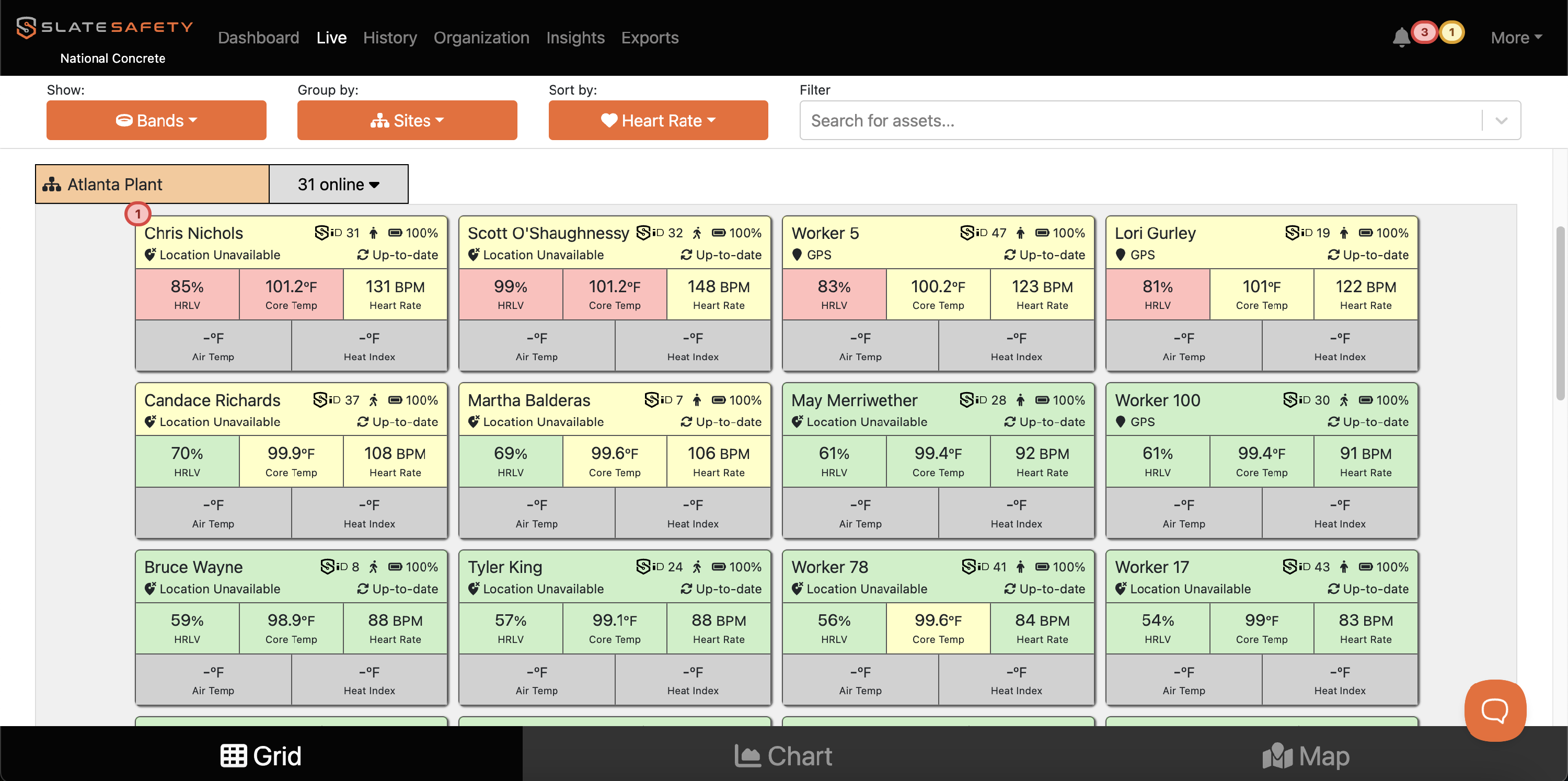
Exposure Zones
Exposure Zones provide an easy way to classify a worker’s physiological or environmental data as High, Moderate, or Normal. These zones help safety teams quickly understand when a worker may be experiencing an elevated core temperature, exertion level, or environmental stress. By organizing data into exposure categories, organizations can track how often workers are entering higher-risk conditions and identify patterns over time.
Note: Exposure Zones were previously called Intensity Levels.

Exposure Zones support stronger safety programs by giving supervisors a straightforward tool for monitoring risk, setting thresholds, and evaluating whether controls and work-rest practices are effective.
What are the Exposure Zones?
Each metric has three exposure zones:
| Exposure Zone | Color | Example Meanings* |
| High |
🟥 |
|
| Moderate |
🟨 |
|
| Normal |
🟩 |
|
*Because all organizations are different, exposure zones can be configured within SlateSafety to have any meaning desired by the organization. Commonly, organizations configure exposure zones to correspond with occupational exposure limits (OELs) or threshold limit values (TLVs).
Please see the instructions below to learn how to custom configure your organization's Exposure Zones.
How to Configure Chart Exposure Zones
- From the Organization page find the Settings tab.

- Scroll down to Chart Exposure Zones and click Edit.
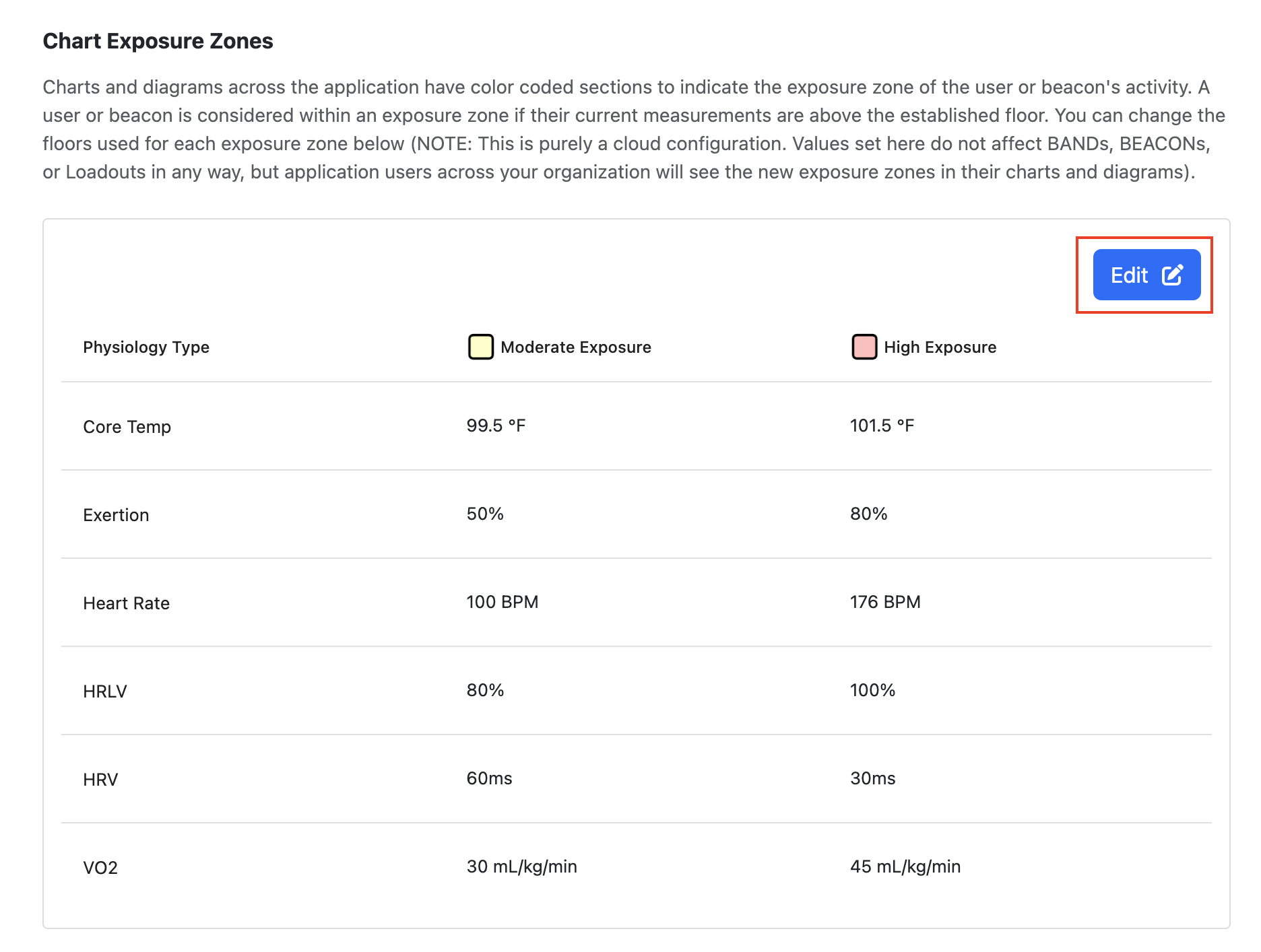
- The Moderate Exposure levels indicate when the yellow color begins. The High Exposure levels indicate when the red color begins. Edit these intensity levels, and then click Save.
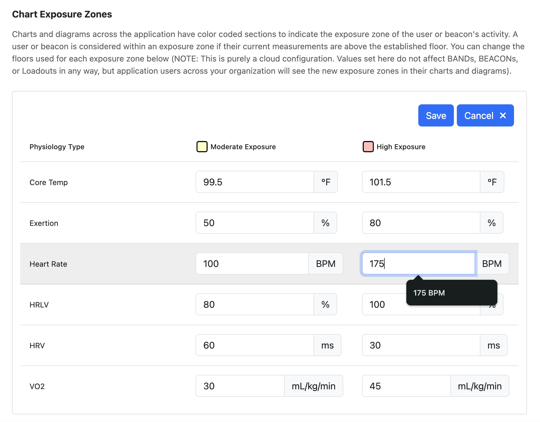
- The metrics on the Live Page and History Page will now reflect the new green-yellow-red exposure zones that you have selected.